
Trending Products
Soon stocks will run out
Dont miss this opportunity while supplies last.
Original price was: රු1,400.00.රු1,200.00Current price is: රු1,200.00.

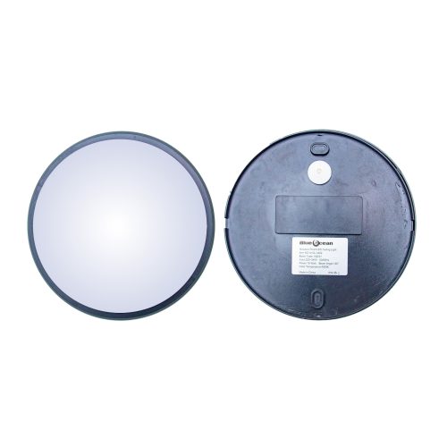
Original price was: රු22,000.00.රු21,000.00Current price is: රු21,000.00.

Original price was: රු14,000.00.රු12,000.00Current price is: රු12,000.00.

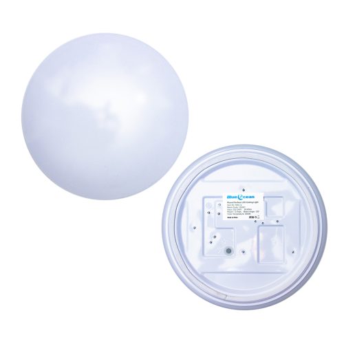
Original price was: රු499.00.රු390.00Current price is: රු390.00.
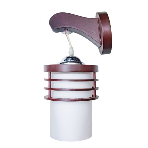
Original price was: රු4,000.00.රු3,750.00Current price is: රු3,750.00.
Original price was: රු4,000.00.රු3,750.00Current price is: රු3,750.00.
Almost Finished SALE
Soon stocks will run out
Dont miss this opportunity while supplies last.
Original price was: රු22,000.00.රු21,000.00Current price is: රු21,000.00.
Original price was: රු28,000.00.රු25,000.00Current price is: රු25,000.00.

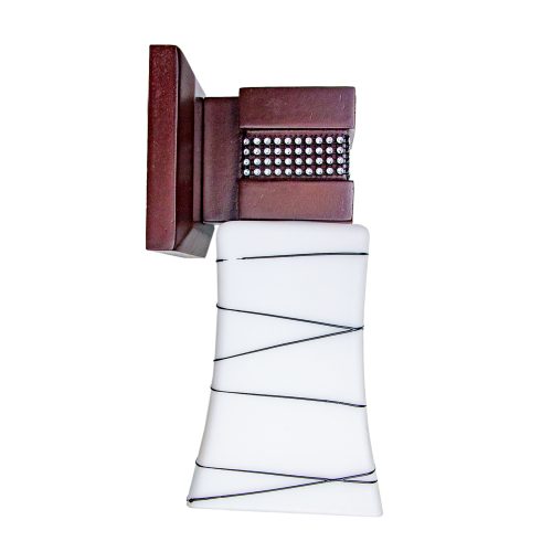
Original price was: රු7,000.00.රු6,500.00Current price is: රු6,500.00.
Original price was: රු7,000.00.රු6,500.00Current price is: රු6,500.00.
Original price was: රු1,400.00.රු1,200.00Current price is: රු1,200.00.
Original price was: රු1,400.00.රු1,200.00Current price is: රු1,200.00.